Designing a multi-role event platform for one of India's most influential business forums.
IGF - India Global Forum - runs high-stakes events attended by heads of state and global investors. Their entire operation was manual. I had to figure out why that was a problem before I could design a way out.
An operation of this prestige, running entirely on email and spreadsheets
India Global Forum is a prestigious UK-based organisation. Their annual summits bring together prime ministers, global investors, and senior business leaders across multiple countries. And yet - there was no app. No mobile-first experience. No way for a delegate to check their schedule, find their session, or connect with another member without picking up a phone.
Everything ran manually: delegate registration exported from a third-party platform, speaker confirmations over email, schedule changes communicated through broadcast messages, and content updates that required a developer to go live.
The ask seemed straightforward: build an app. But before opening Figma, I needed to understand what was actually broken - and for whom.
Reading the spec as a research artifact
There was no user research in the traditional sense - IGF's delegates are heads of state, global investors, and senior executives. What I had instead was a dense 50-feature specification document. I read it not as a requirements checklist, but as a research artifact.
Every ambiguity in the spec revealed a decision that had been deferred. Every feature that depended on another feature behaving a specific way exposed a gap in the operational logic. I logged all of it before designing anything.
What I surfaced from the spec: Over 10 undefined behaviours - edge cases like what happens when a session reaches capacity mid-booking, how the app handles a Cvent sync failure, and what access state an EA is left in when their director revokes permissions mid-registration. Each one became a design decision I had to resolve before wireframing could begin.
I also mapped the operational workflows that existed outside the spec: how IGF staff currently managed content, how speakers confirmed participation, and how delegates got event-day information. Understanding what had to be replaced - not just what had to be built - shaped every architectural decision that followed.
Six user types, one coherent product
The most consequential early insight: this wasn't one product for one type of user. It was six products with shared infrastructure. Before wireframing a single screen, I mapped each user type's core journey - what they see on first open, how they authenticate, what their home state looks like, and which features they can and cannot access.
The design implication was significant: no two users see the same home screen. Navigation, dashboard content, notification types, and feature access all branch by role. The architecture had to handle all six without duplicating the codebase.
Design constraint this created: A single component system that composes by role context rather than duplicating screens. The same event detail card needed to show "Book this session" to a delegate, "You're speaking at this session" to a speaker, and "Edit session" to an admin - without three separate implementations.
Architecture before screens
A spec of this scale - 50 features, 6 user types, three delivery phases - requires structured process more than talent. I couldn't open Figma and start wireframing. I had to build the architecture before I touched a frame.
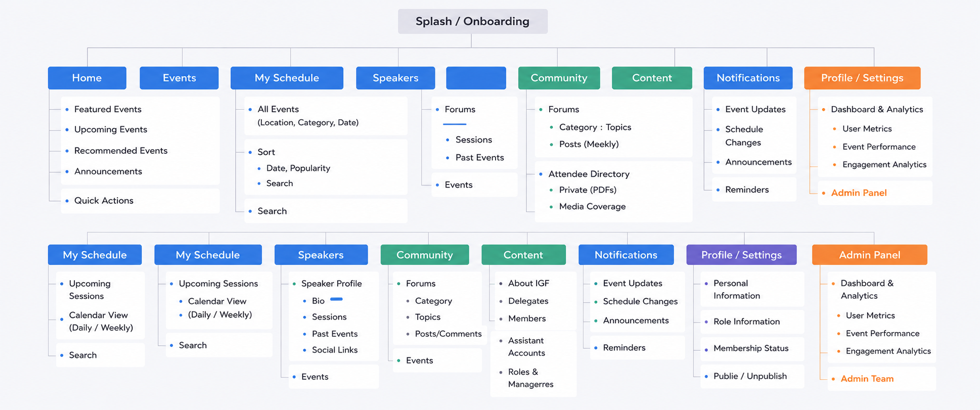
The first deliverable wasn't a wireframe. It was a sitemap: every section, every sub-section, every user role's access level, mapped before a single screen was designed. This became the design contract - the shared reference that stopped features being designed in isolation or conflicts being discovered at handoff.
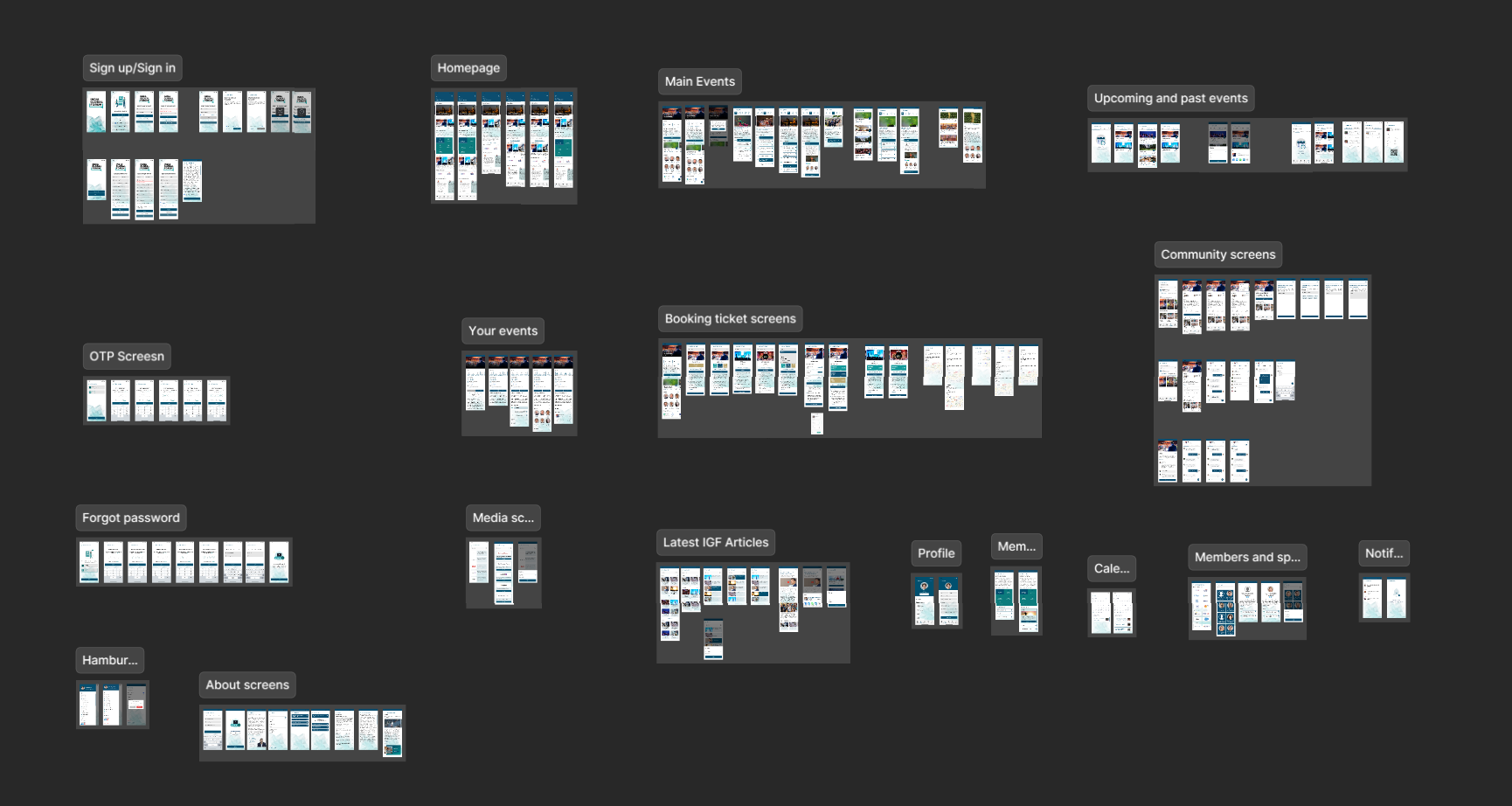
With the architecture settled, I moved into screen design. The scope was significant: sign up and sign in flows, OTP screens, forgot password, homepage, main events, upcoming and past events, booking tickets, your events, calendar, media screens, community screens, latest IGF articles, profile, members and speakers, notifications, and about screens.
Every screen group was designed with role-adaptive components - meaning the same screen skeleton could surface different content and controls depending on who was authenticated, without forking the design into separate role-specific files.
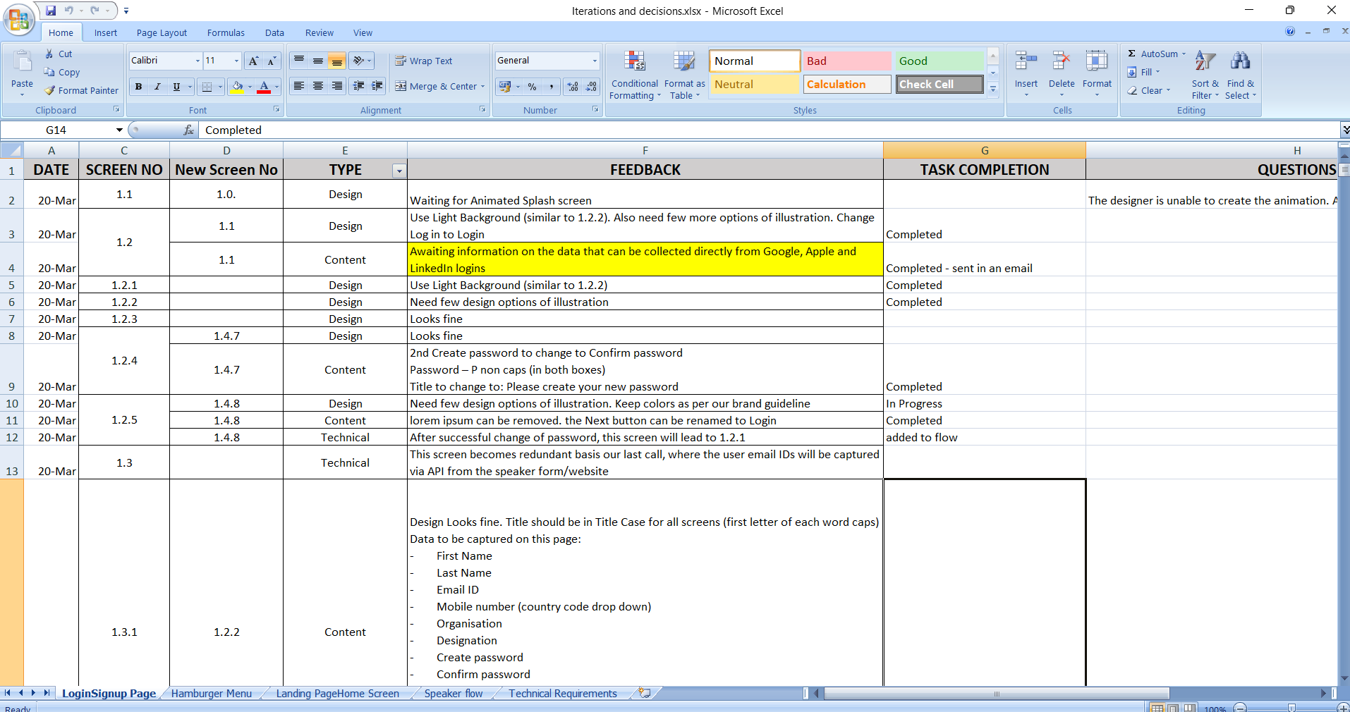
Design didn't happen in a single pass. Each screen group went through structured client review cycles. I maintained a per-screen feedback tracker - logging each piece of feedback by type (design, content, or technical), the screen number it applied to, what changed, and whether the change was completed, in progress, or blocked pending client input.
This tracker served a second purpose: it became the source of truth for the handoff conversation. Developers could see exactly which screen decisions had been confirmed, which were awaiting final approval, and where outstanding questions still lived.
Key Integrations Designed Around
Key screens, one at a time
Each screen below solved a specific problem. Here's what was decided and why.
Screen 01 - Home Dashboard
Everything a delegate needs at a glance
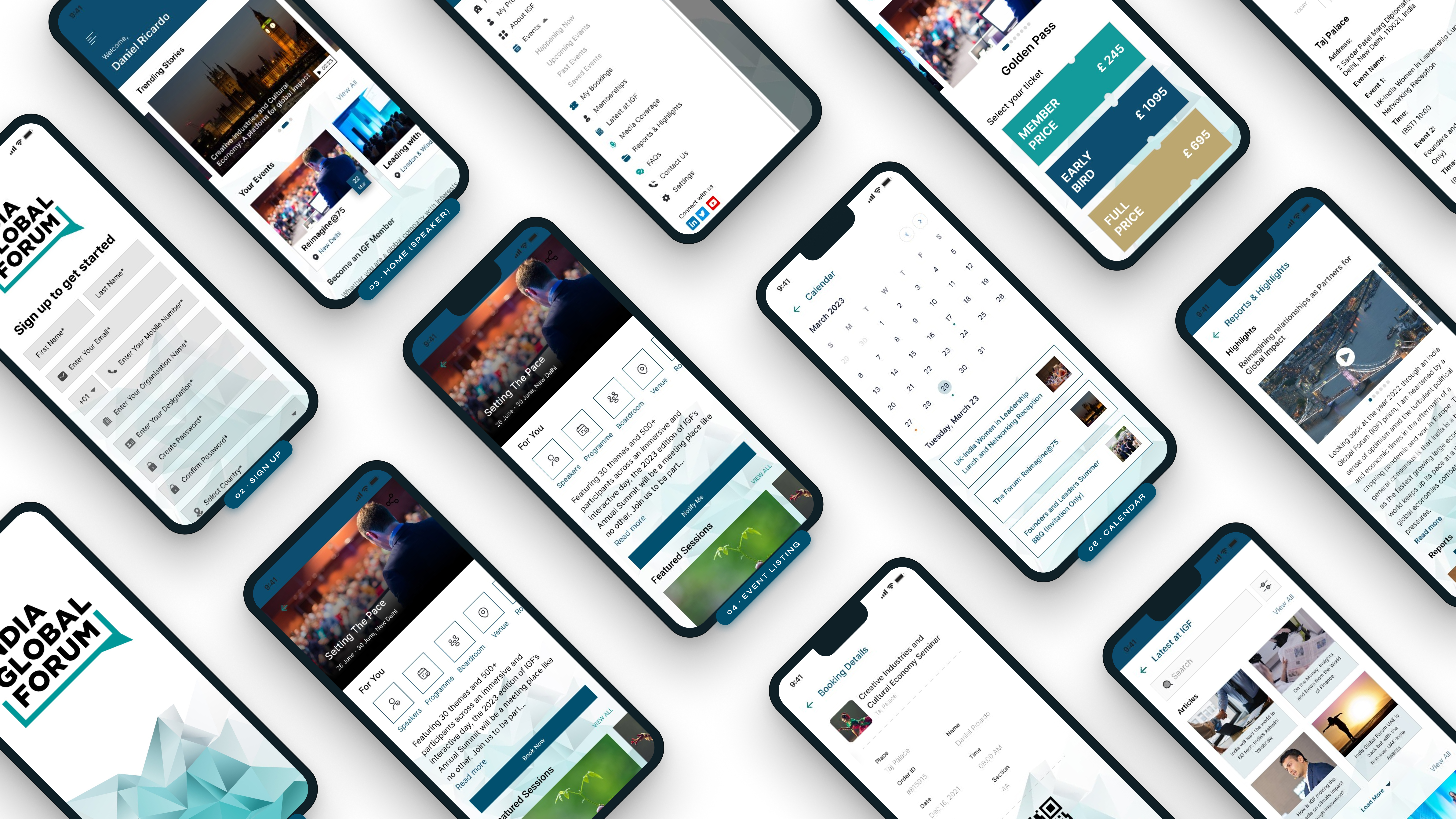
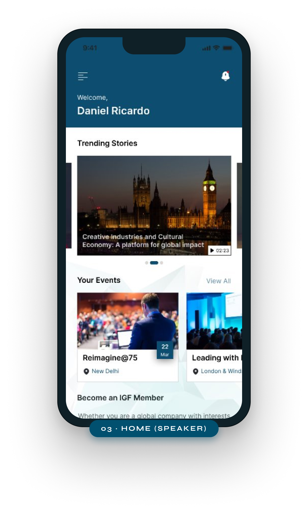
The home screen surfaces trending stories, personal upcoming events, IGF membership prompts, and partner logos - all in a single scroll. Rather than splitting content across tabs, the dashboard acts as a personalised briefing. Delegates see what's relevant to them without navigating.
Design decision
One screen, full context. Trending content, personal schedule, and membership CTA coexist so users land with orientation, not choices.
Screen 02 - Booking Details & QR Entry
Entry credential lives in the app, not an email
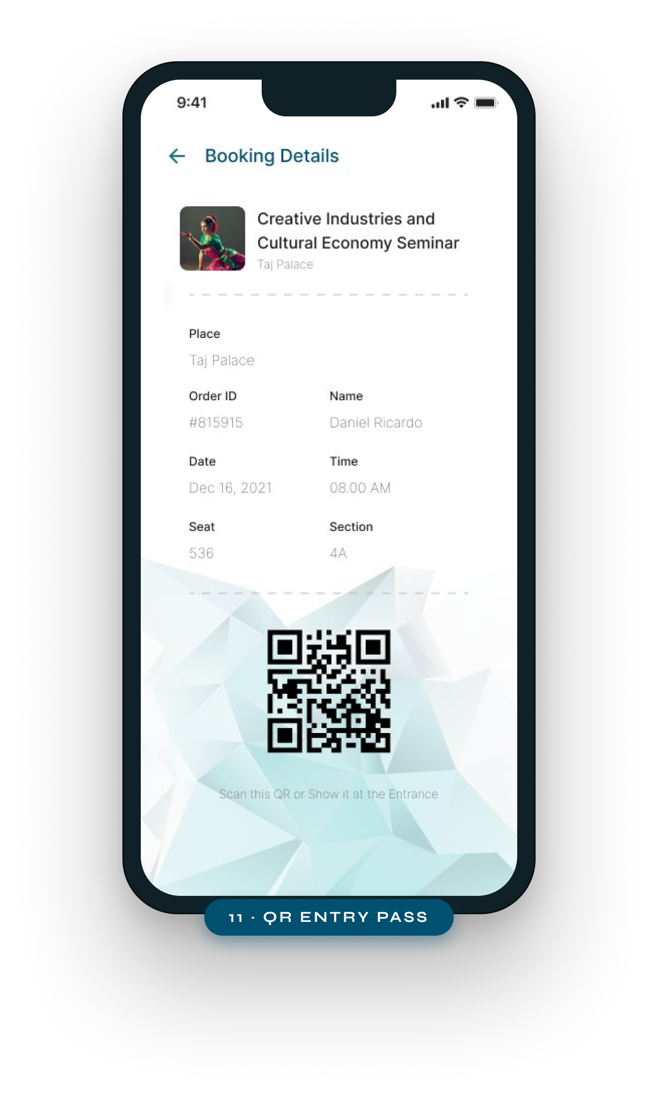
Booking details - event name, venue, order ID, seat, section, date and time - are displayed clearly above the QR code. The code is always reachable from the ticket screen without a data connection, so delegates can show it at the door even in low-signal convention venues.
Design decision
Offline-first QR. The entry credential is stored locally so the app works at the door with zero connectivity - preventing first-minute failures.
Screen 03 - Personal Calendar
Bookmarked sessions visible by date, not buried in a list
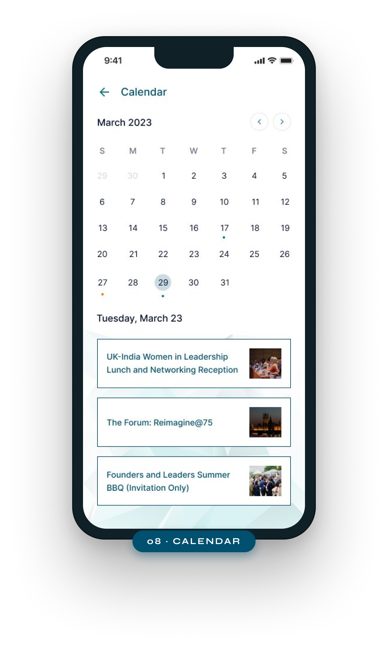
The calendar view shows which days have sessions, and tapping a date reveals the sessions booked for that day as cards below. Colour dots indicate session density - letting delegates quickly see busy vs. free days. Sessions link directly to their detail pages for one-tap context.
Design decision
Calendar as primary navigation for time. Delegates at multi-day events think in days, not lists - the calendar matches how they plan.
Screen 04 - Booking Information
Three-tier pricing made scannable, not a wall of text
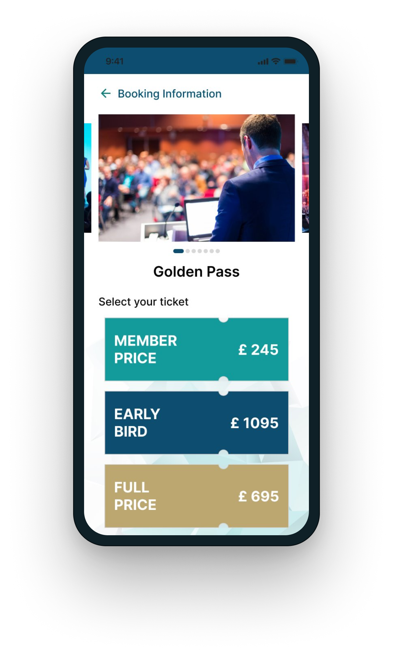
Member, Early Bird, and Full Price are displayed as distinct colour-coded blocks - not radio buttons or a dropdown. The active early bird deadline is surfaced inline. Delegates can see all three options and their prices in a single glance without scrolling, and the "Book Now" CTA sits below the selection.
Design decision
Price tiers as visual cards, not a form. Each tier is visually distinct so delegates compare instantly - the decision happens in seconds, not minutes.
Screen 05 - Event Programme
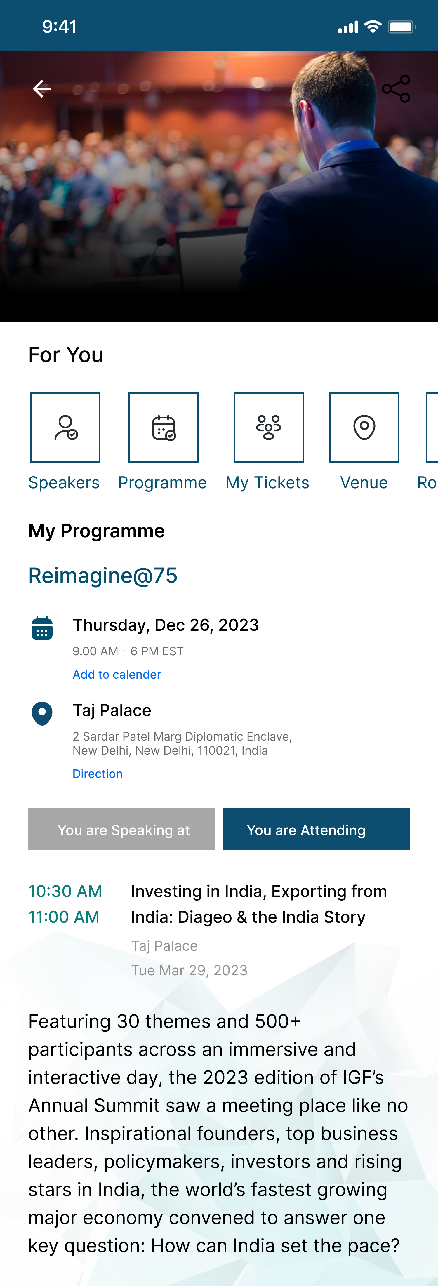
Speaker, venue, time and status - all on the event page
The event detail page shows role-adaptive status ("You are Speaking at" vs "You are Attending"), quick navigation tabs (Speakers, Programme, My Tickets, Venue), session timetable with linked speaker profiles, and an "Add to Calendar" CTA. Delegates see everything they need to prepare for an event without leaving the screen.
Design decision
Role-adaptive status badge. The same event screen shows different context labels (Speaking / Attending) so the experience feels personal without duplicating screens.
Screen 06 - Session Timetable
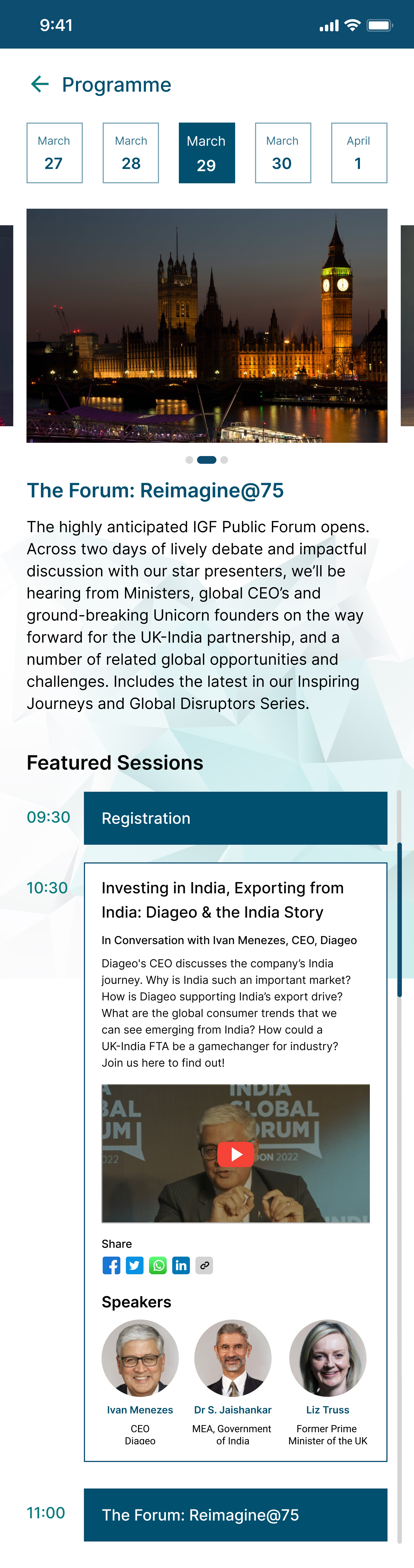
Date-strip navigation keeps multi-day schedules manageable
A horizontal date strip at the top lets delegates switch between conference days in one tap. Each session card shows time, title, description snippet, a video thumbnail where available, social share options, and linked speaker avatars. Delegates can share individual sessions directly from the programme.
Design decision
Day-strip instead of a dropdown. Tapping a date is faster than opening a picker - and visible dates give context that a dropdown hides.
Screen 07 - Community
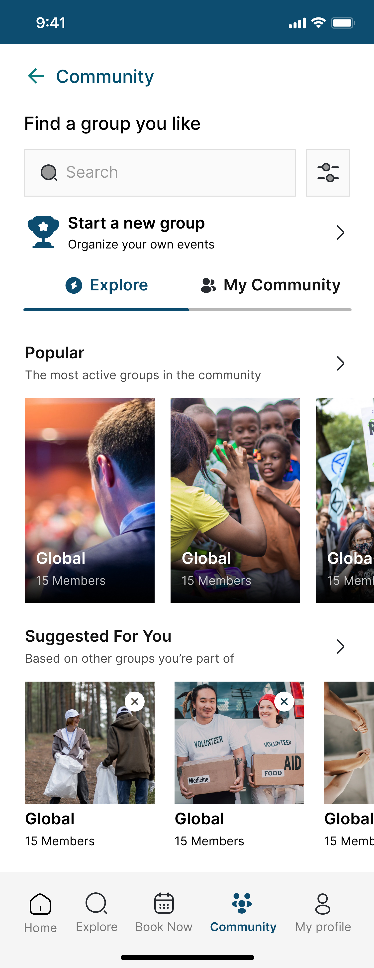
Gated access that doesn't feel like a wall
The community forum is available only to verified IGF Members and Speakers. Rather than a hard lock, the screen shows the community content structure - Popular groups, Suggested For You - so users understand the value before being asked to verify. The "Start a new group" CTA is accessible to all to encourage engagement entry points.
Design decision
Show before gate. Delegates see what they're missing before being asked to verify - turning a hard block into a motivated upgrade path.
What this platform replaced
Since this was a pre-launch product, impact is measured against the baseline - a fully manual event operation run across email, phone calls, and a website not built for mobile. Every number below represents a process that previously didn't exist in any digital form.
Design-driven operational changes: The personalised schedule module replaced "check the website." Push notifications replaced post-change email chains. The speaker workflow replaced email submission and phone confirmation. The admin console replaced manual content updates requiring developer time. The community forum replaced chance hallway conversations - with a moderated, verifiable, invite-gated space for the world's most influential India-focused business community.