Designing an end-to-end property repair platform that replaced a WhatsApp-based workflow.
Rosco & Perlini - a UK water damage repair company - was running their entire workflow over WhatsApp and email. I designed the end-to-end digital platform that replaced it.

What I was solving for
Rosco & Perlini is a UK property repair company specializing in water damage - damp proofing, mould treatment, flat roof waterproofing, and more. The client came with a clear pain: his team was handling everything manually. Customers called in, sent photos over WhatsApp, estimates were done on spreadsheets, and scheduling happened over back-and-forth emails. There was no system, and it was starting to cost their bookings.
Six things that were genuinely broken
Before touching any design tool, I mapped the operational failures. The core issue wasn't just "no app" - it was a fragmented coordination chain across four people who each needed different information at different times.
What I did before drawing anything
Since the product was pre-launch without direct user access, I ran a lean discovery using what was available - the spec document, workflow mapping, competitive analysis, and a structured gap log to surface what the spec hadn't answered.
- Spec document deep-read: I treated the 10-page specification as a primary research artifact. I annotated every workflow dependency - places where one user's action was a prerequisite for another user's next step.
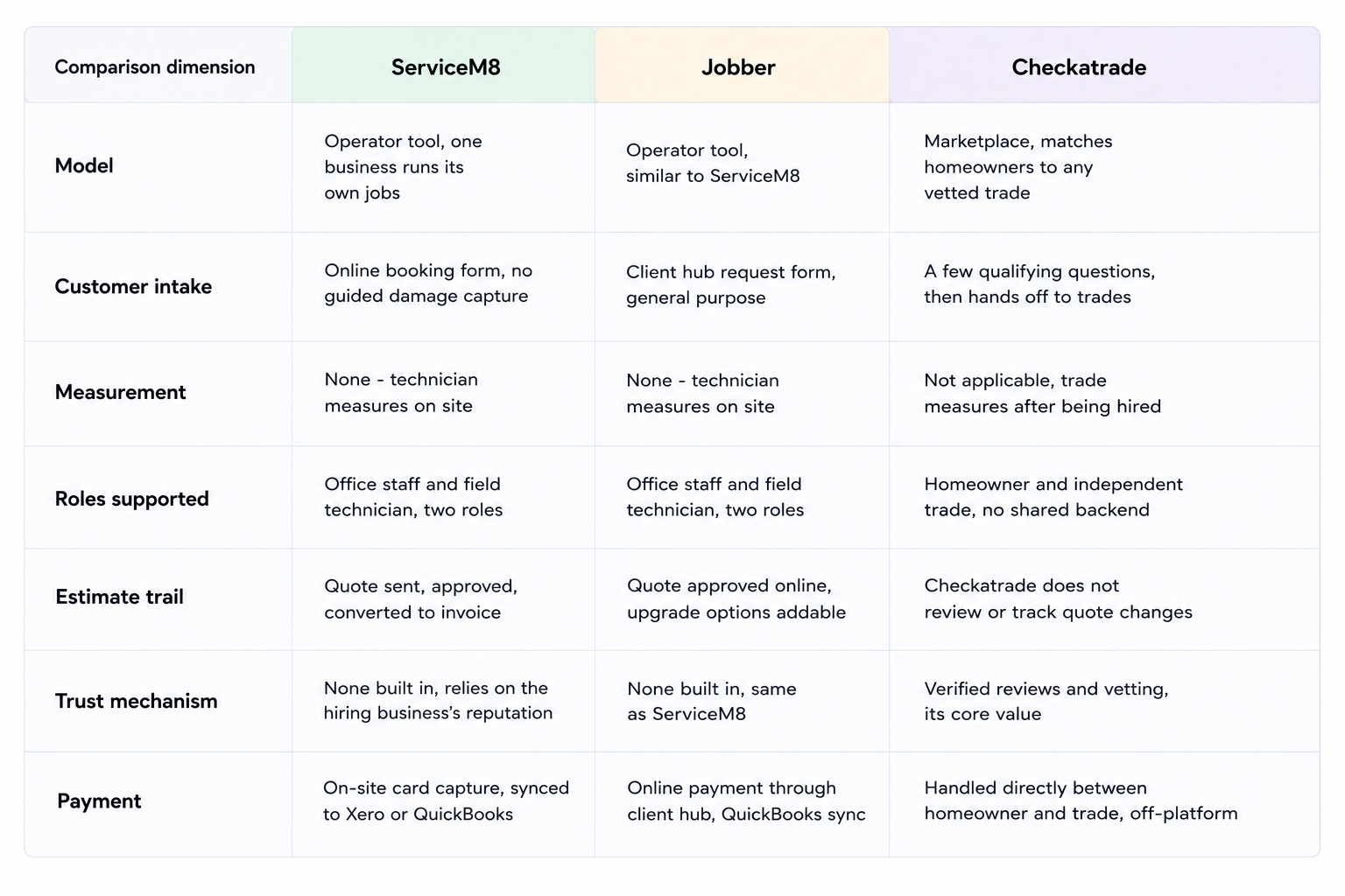
- Competitive analysis: I studied platforms like ServiceM8, Jobber, and Checkatrade - not to copy patterns but to understand where field service coordination products typically fail on mobile and what they get right.
- Gap log creation: I identified and documented 10 critical questions the spec left unanswered. Each had a direct design impact. I resolved all of them before wireframing.
- Mental model mapping: I wrote out what each user type would think when they first opened the app. This drove the landing page hierarchy for every role.
Competitive analysis — ServiceM8 vs Jobber vs Checkatrade
What the research revealed
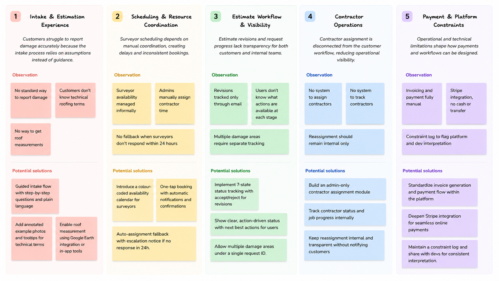
Findings from stakeholder interviews, spec analysis, and competitive review — grouped into five core problem clusters before any design work began.
Four user types, four mental models
This wasn't a single-persona app. Each user type had a fundamentally different relationship with the platform - different goals, different digital literacy, and different stakes. Designing for all four simultaneously was the central challenge.
A key insight from mapping these users: the customer is the initiator, but the admin is the system backbone. Every workflow - booking, estimate, contractor assignment, payment - has an admin checkpoint. My design had to honor that power structure while keeping the customer experience feeling self-service and simple.
The full service blueprint
I mapped the complete end-to-end journey across all five actors - Customer, Surveyor, Admin, Contractor, and System - across seven workflow stages. This became the single reference document for the entire design and development process. Every edge case, every handoff point, every notification trigger is documented here.

One platform, four separate experiences
The biggest IA challenge: four user types sharing one codebase but each needing a completely different experience after login. I designed role-based navigation - each user sees only what's relevant to their job. I built this sitemap before a single screen was drawn.

I also designed the 7-state job status system end-to-end. This was critical because status drove what actions were available to each user at any point in the workflow - a customer on "Surveyor review pending" should never see a "Book Contractor" button.
From manual estimates to a guided flow
One of the biggest UX challenges in this project was the pricing estimation process. Previously, customers had to exchange messages, upload photos, and wait for manual calculations before receiving an estimate. The process was slow, inconsistent, and often required additional follow-ups from the team.
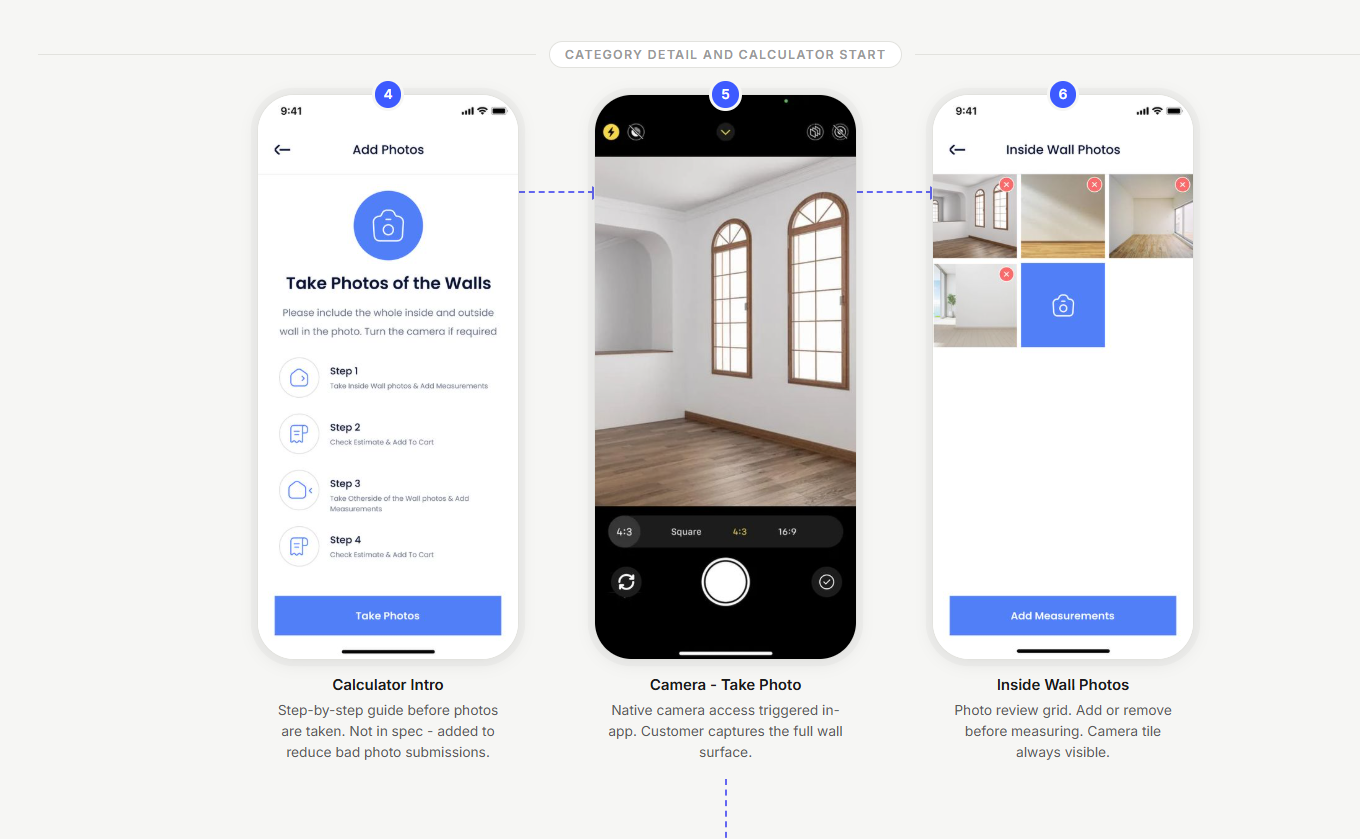
Rather than creating a simple calculator, I designed a guided experience that collects the right information step by step. Users can upload photos, provide measurements, review an automatically generated estimate, and move forward with confidence while giving the business structured data that can be validated and refined.
13 screens. One continuous journey that transforms a manual quoting process into a structured digital experience.
Key screens, one at a time
Each screen below solved a specific problem. Here's what was decided and why.
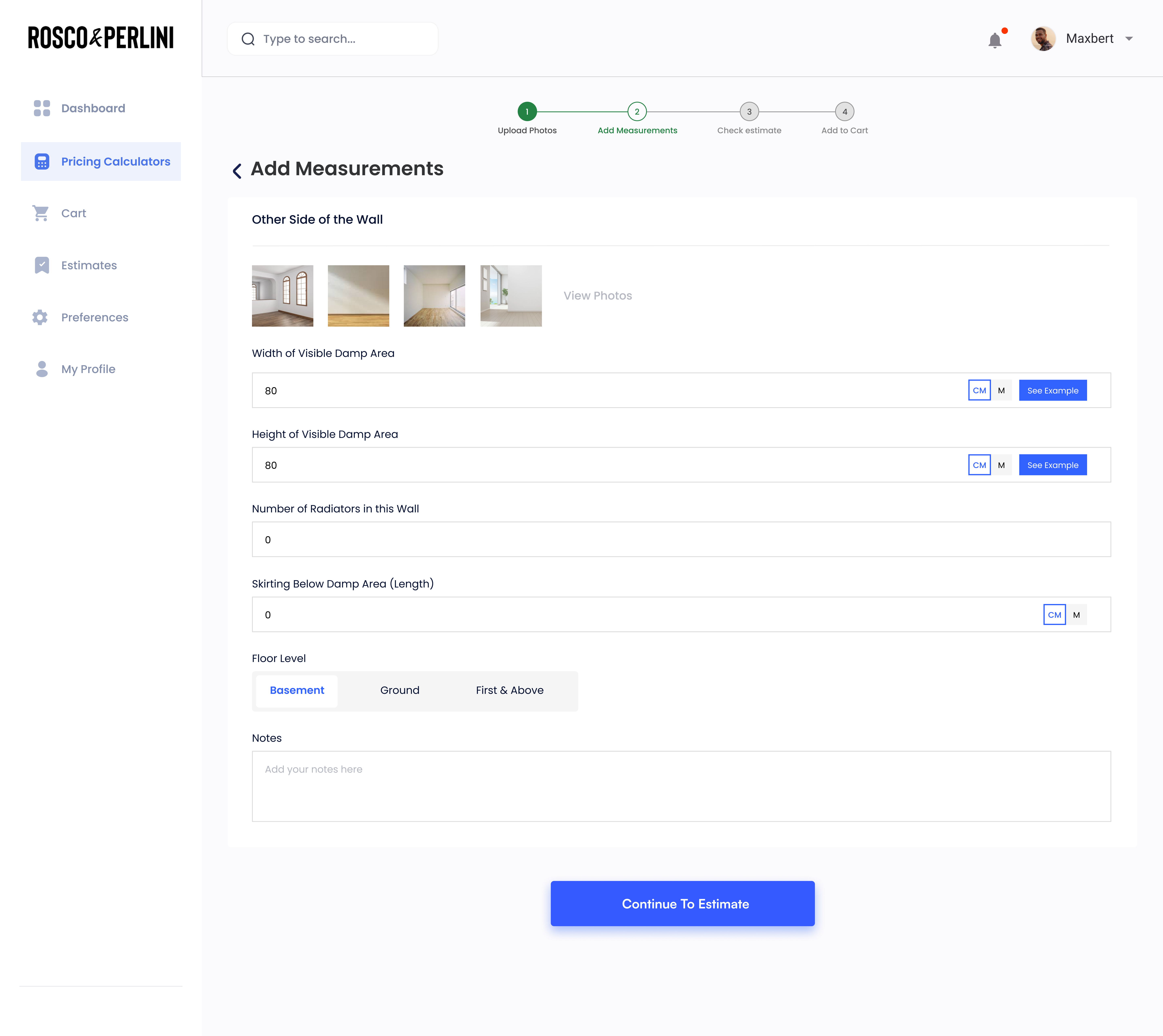
Screen 01 - Pricing Calculator
Measurements with a "See Example" escape hatch
Asking homeowners for wall dimensions and corner counts is cognitively demanding. Most don't know what a "skirting length" is. Rather than simplifying the form, we added a "See Example" button on every technical field - an inline photo showing exactly what to measure and where.
Keep the form complete - don't hide fields. Reduce confusion with contextual examples, not by removing what we need.
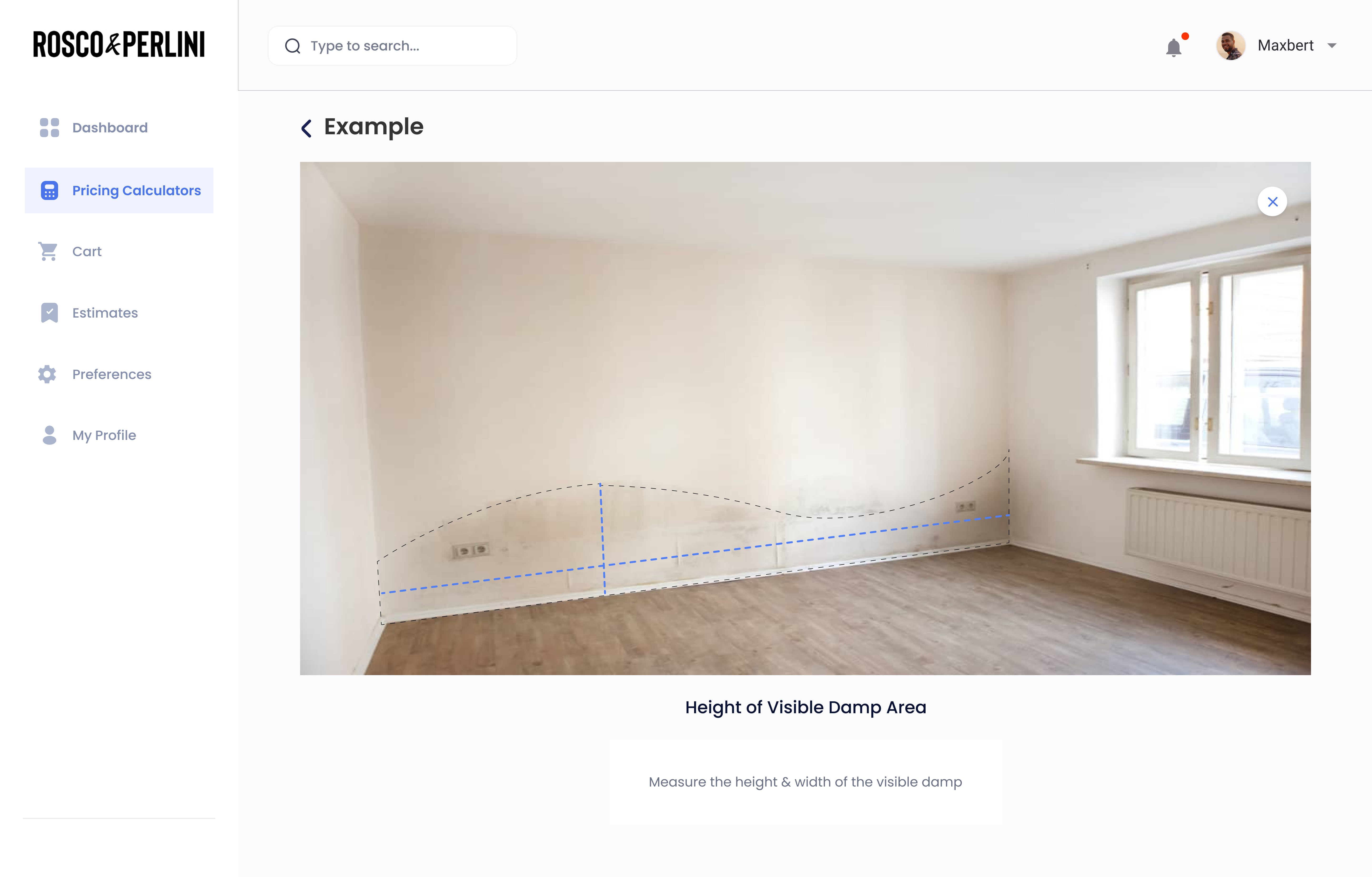
Screen 02 - Measurement Example
A photo that teaches, not a tooltip that explains
When a user taps "See Example," they get a full-screen annotated photo showing the exact measurement being asked - with a caption and the dotted boundary drawn on. No written instructions. The image does the work.
Real photos of real damp - not diagrams. Customers recognise their situation and immediately know what to measure.
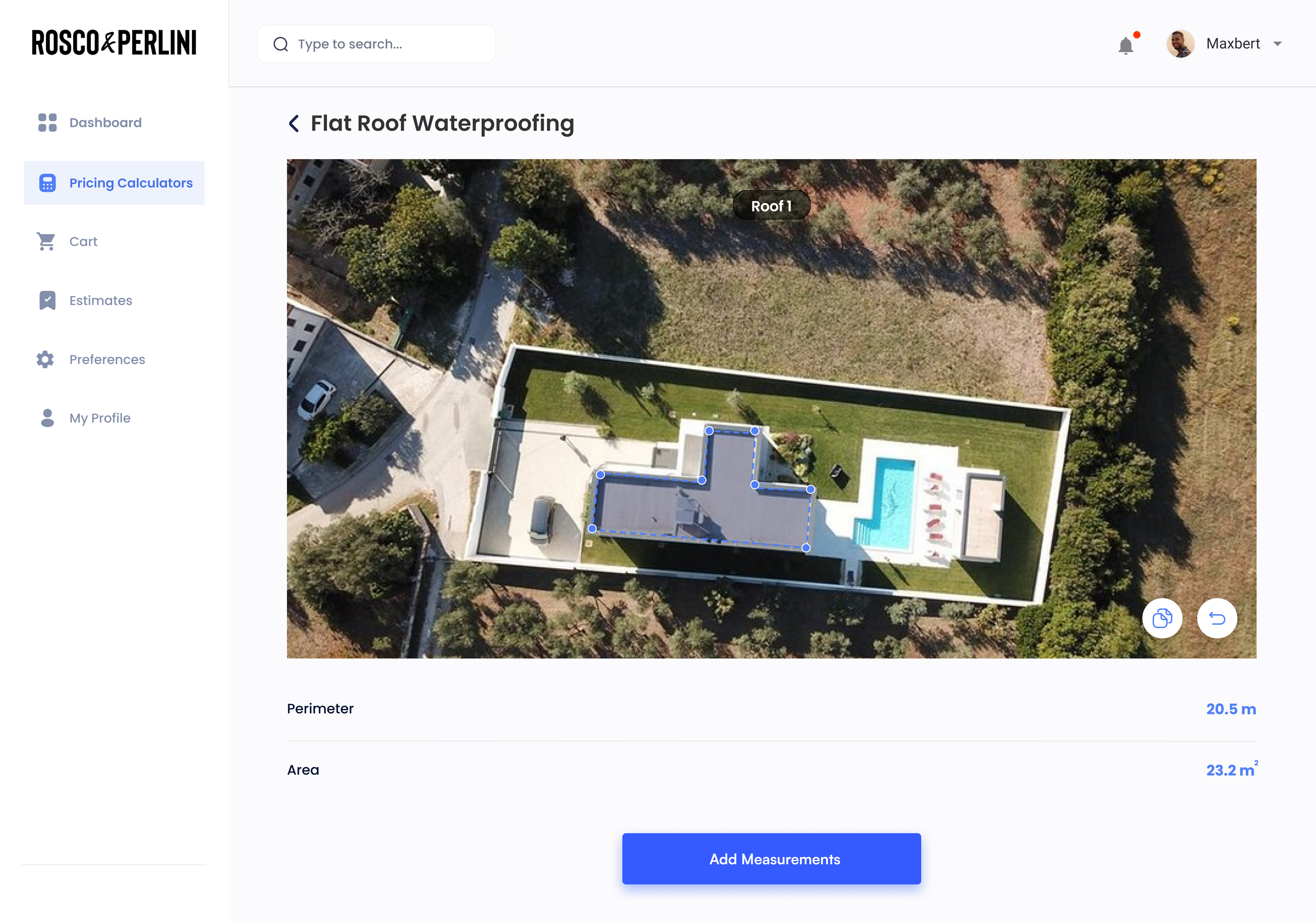
Screen 03 - Flat Roof Waterproofing
Google Earth instead of a tape measure
For flat roof waterproofing, customers need to provide roof square meterage - something no homeowner has memorised. Instead of asking them to estimate, we embedded the Google Earth tool scoped to this category only. They draw around their roof, and the measurement fills in automatically.
Remove the guesswork. Accurate roof measurements directly improve estimate accuracy and reduce surveyor revision rates.
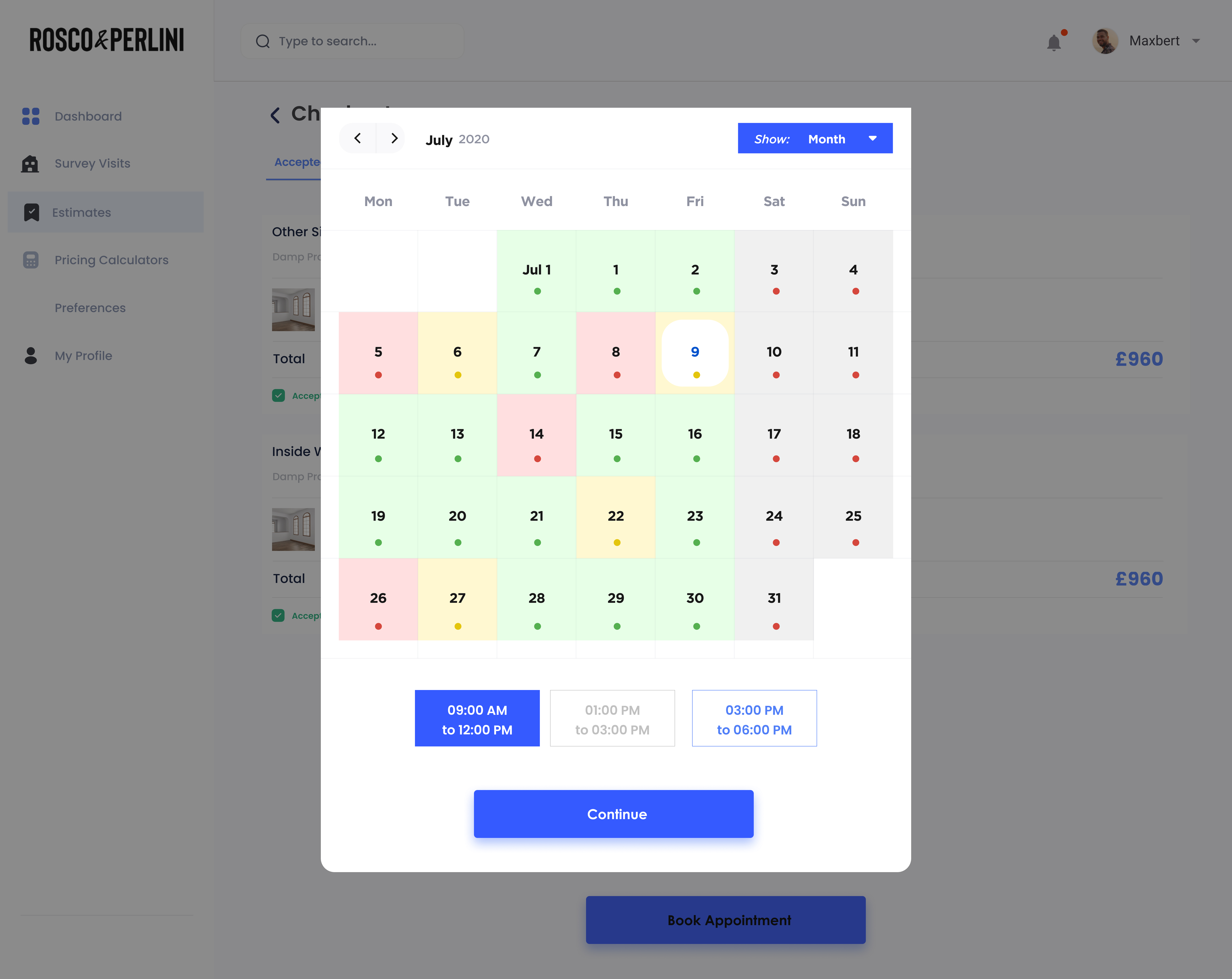
Screen 04 - Booking Calendar
Availability shown by day, not a dropdown
The calendar modal overlays the estimate review so context isn't lost. Days are colour-coded by availability density - green (open slots), amber (limited), red (full) - so customers pick intelligently without needing to click through each date. Time slot selection is a single tap.
Colour-coded days eliminate the need to open each date. Customers book in one step - not five.
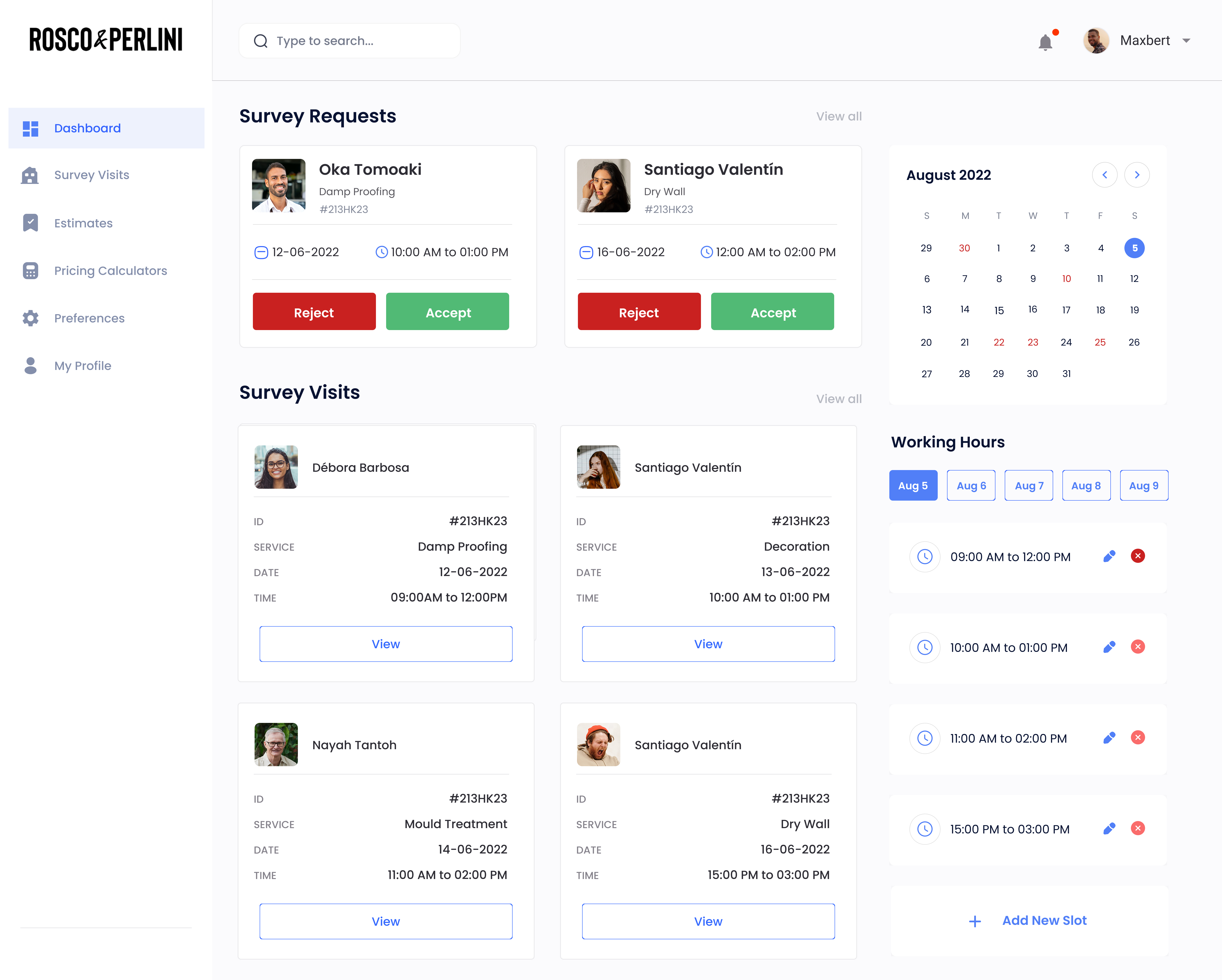
Screen 05 - Surveyor Dashboard
Request + visits in one view, with working hours on the right
Surveyors need two things immediately: what they need to respond to (requests), and what's confirmed for their calendar (visits). The third panel on the right shows and edits working hours inline - so managing availability doesn't require navigating to a separate settings screen.
Requests, visits, and availability in a single view. No navigation required - everything a surveyor needs to act is on one screen.
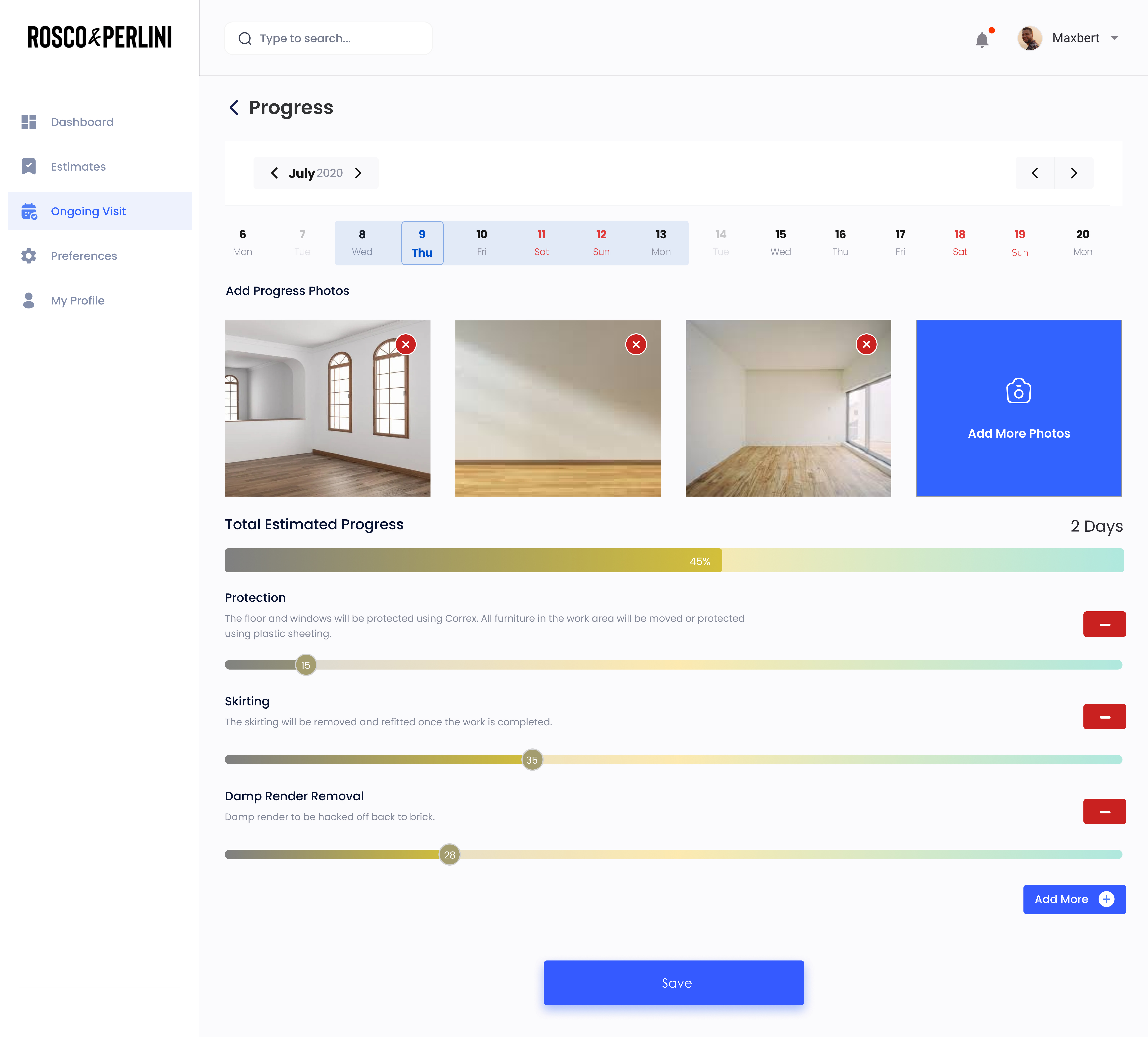
Screen 06 - Ongoing Visit
Progress tracked by task, not just a single percentage
Rather than a single job completion status, the ongoing visit screen breaks progress into individual tasks - Protection, Skirting, Damp Render Removal - each with its own percentage slider. Surveyors upload photos per visit, giving both admin and the customer a live record of what's been done.
Granular task progress eliminates "I don't know what's happening" calls. Customers see what specifically is done, not just that it's in progress.
What I shipped
I designed both platforms end-to-end - a mobile site for customers, surveyors, and contractors, and a web admin console for operations. Below is a cross-section of the key flows across each user role.


Where the real design work happened
The spec gave me the "what." These were the "how" problems I had to solve through design thinking alone.
- The contractor availability paradox: Contractors don't set their own availability - admins do on their behalf. But customers need to see availability to book. I designed an abstracted "team availability" calendar for customers, and a separate direct availability management module for admins. The two surfaces never conflict from either user's perspective.
- Multiple damage areas in one request: A homeowner could have three different types of damage in one visit. The spec allowed multiple estimates per request. I designed an "add another area" flow within a single estimate session, grouped under one unique request ID, with a clean summary view.
- Surveyor reassignment without customer notification: The spec was explicit - if a surveyor reassigns to a colleague, the customer must NOT be notified. This meant the reassignment flow had to be entirely internal with no outbound trigger. I documented this as a conditional notification rule in the developer handoff.
- The 24-hour surveyor acceptance window: The spec didn't define what happens if no surveyor accepts a booking within 24 hours. I designed an auto-assignment fallback + a customer notification explaining the delay. This was one of the gap log items that required adding 3 new screens not in the original spec.
- Builder.ai constraints: Some design patterns had to be adapted to what the platform could build. I maintained a constraint log throughout the project to flag where design intent needed developer interpretation, and where I had to find an alternate solution.
What this platform replaced
Since this was a pre-launch product, impact is measured against the baseline - a fully manual operation run over WhatsApp and email. The structured pricing calculator replaced ad-hoc photos. The estimate-revision workflow replaced email chains. Stripe replaced manual invoicing. The admin assignment module replaced phone calls between admin and contractors.