UI/UX Design — End to End
A Saudi Arabia-based company was running HR operations across nine disconnected tools with no single source of truth. I led the end-to-end UX and UI - from research through a full high-fidelity prototype - to consolidate it into one mobile-first system.
The starting point was clear on intent but open on scope: replace the disconnected patchwork of tools employees were juggling every day with a single HRMS app. I owned the full scope end-to-end - user research, affinity mapping, personas, sitemap, user flows, low-fidelity wireframes, a design system, and a high-fidelity prototype covering Home, Mail, Profile, and five core HR service modules.
One mobile app. Five core services. Home, Mail, and Profile — all connected. Every HR task an employee or HR manager needs, in a single unified experience.
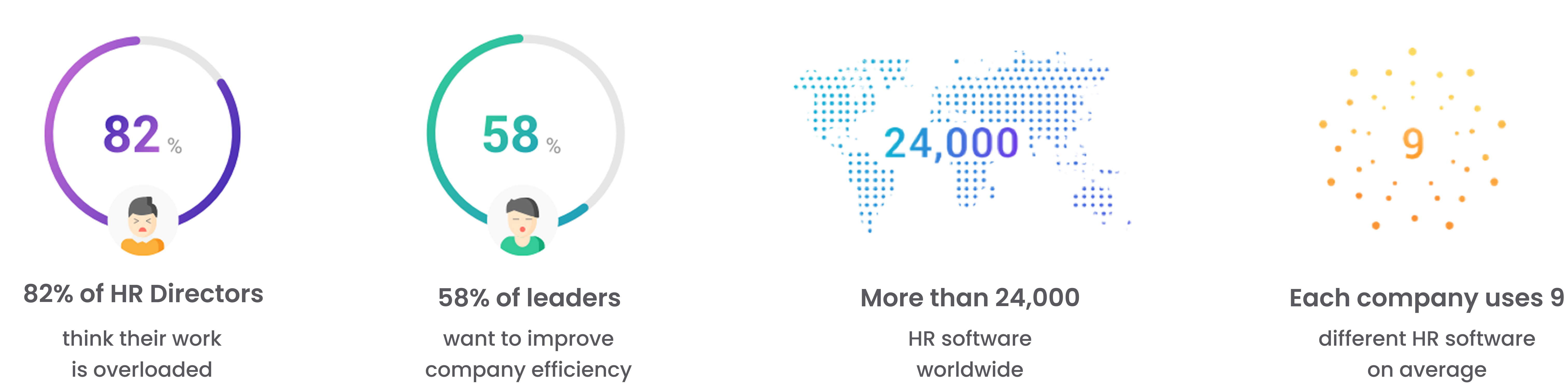
Conducted 8 user interviews over telephone with employees managing HR tasks in their daily work life. Two voices stood out repeatedly:
Looking for a pocket-friendly app to do various tasks on hand.
Looking for a portable office in my pocket.
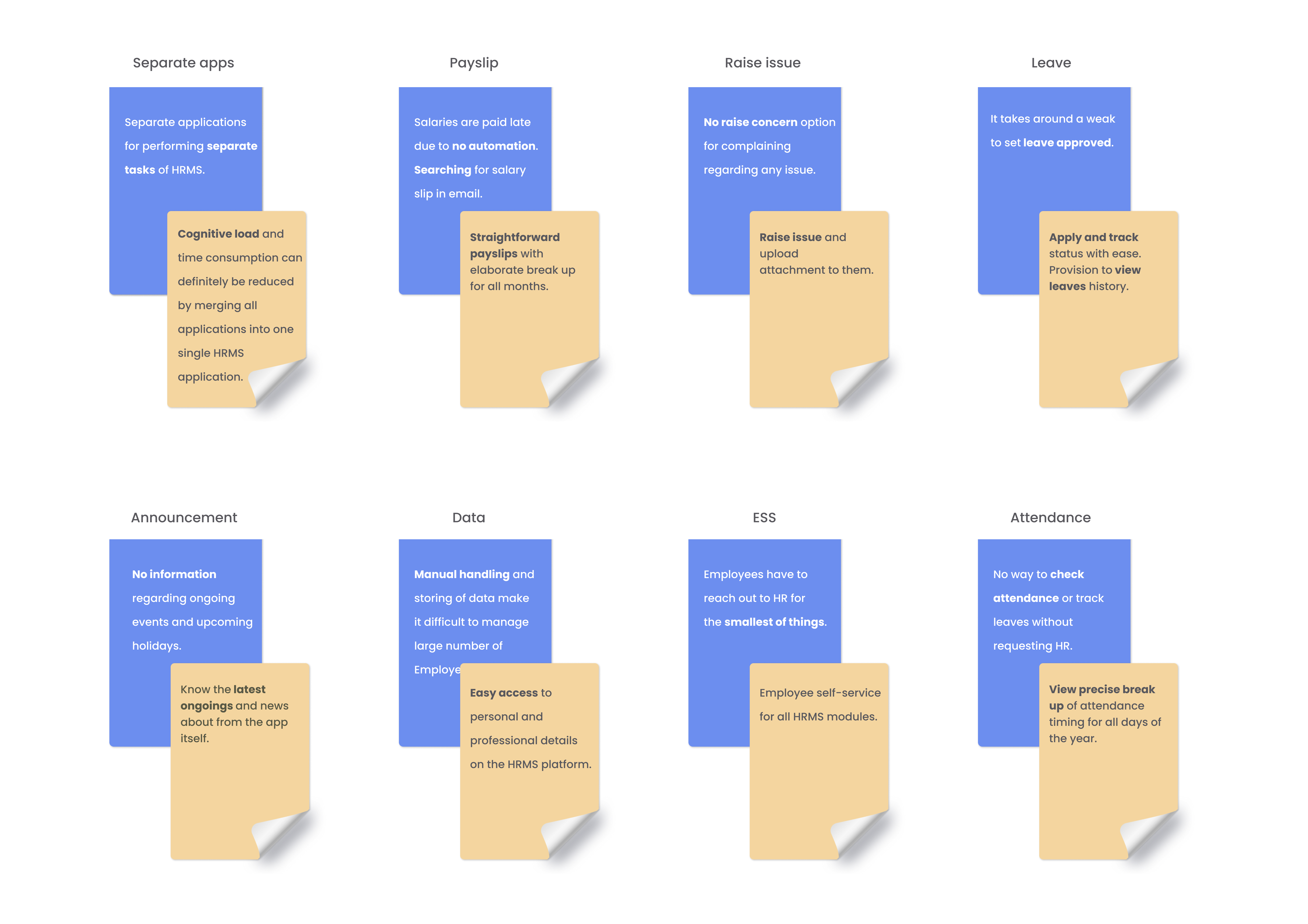
The 8 interviews were synthesised into 8 pain-point-to-goal pairs. Each pain point pointed directly to a feature requirement.
From the interview data, one persona crystallised the core user: a young professional managing multiple work tasks remotely, frustrated by the tool fragmentation and craving a single mobile-first solution.

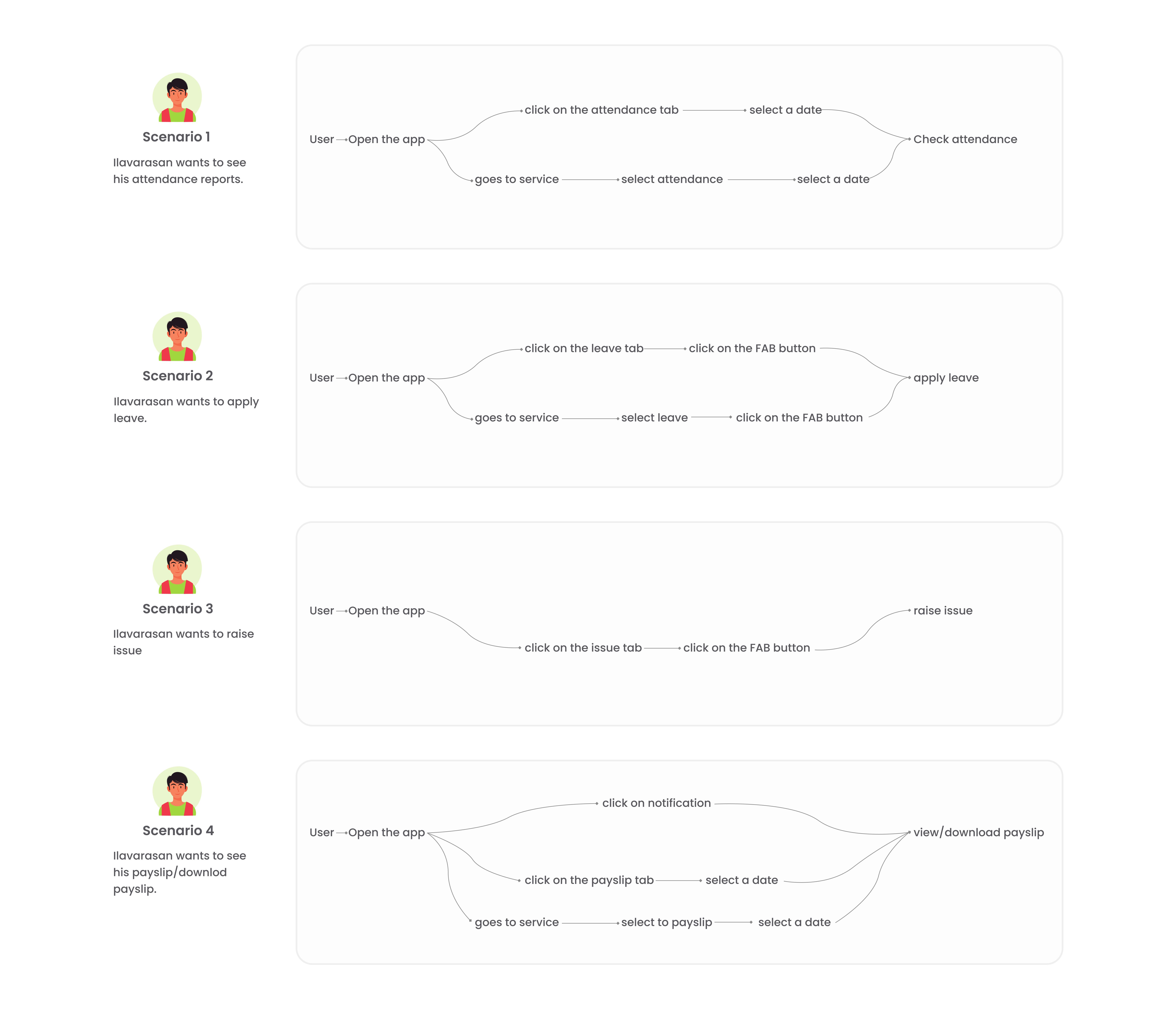
Ilavarasan works remotely from his Mumbai apartment. He needs to apply for leave, but his company uses three separate tools — one for requests, one for tracking, and another for approvals. He's also waiting on a payslip for a tax filing deadline but the payroll portal is desktop-only. He ends up messaging his HR contact on WhatsApp, waiting hours for a response. What he needs is a single app that lets him do all of this in under three minutes, from his phone, without depending on anyone else.
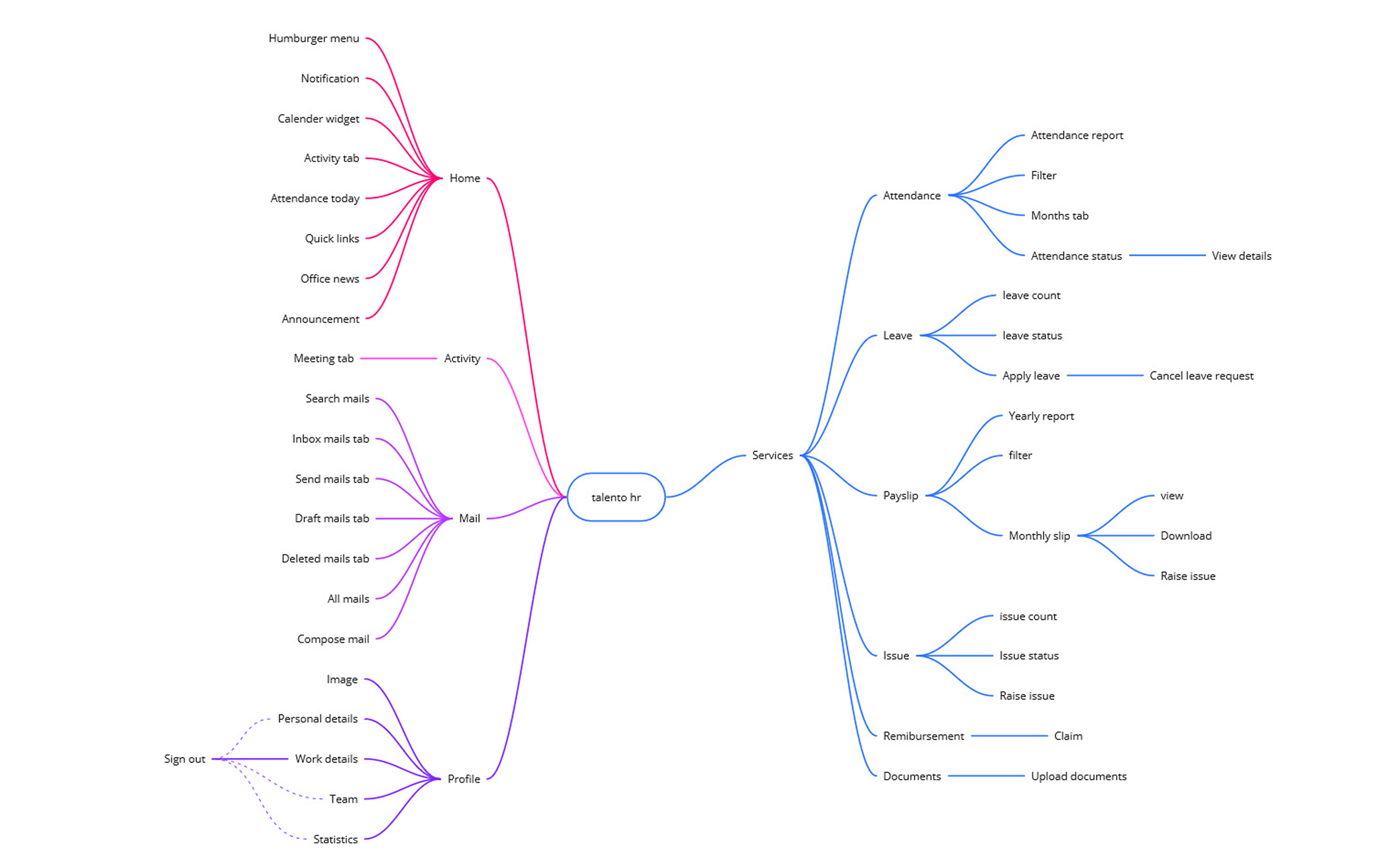
Before a single screen was designed, I built the sitemap. Defining the full content hierarchy upfront keeps screen count honest, surfaces overlaps early, and ensures navigation feels logical to users before any visual design begins.
The app is structured around a bottom navigation bar with five primary tabs: Home, Attendance, Leave, Payslip, and Services. The Services section surfaces the remaining modules that didn't warrant a persistent tab but needed clear hierarchy.
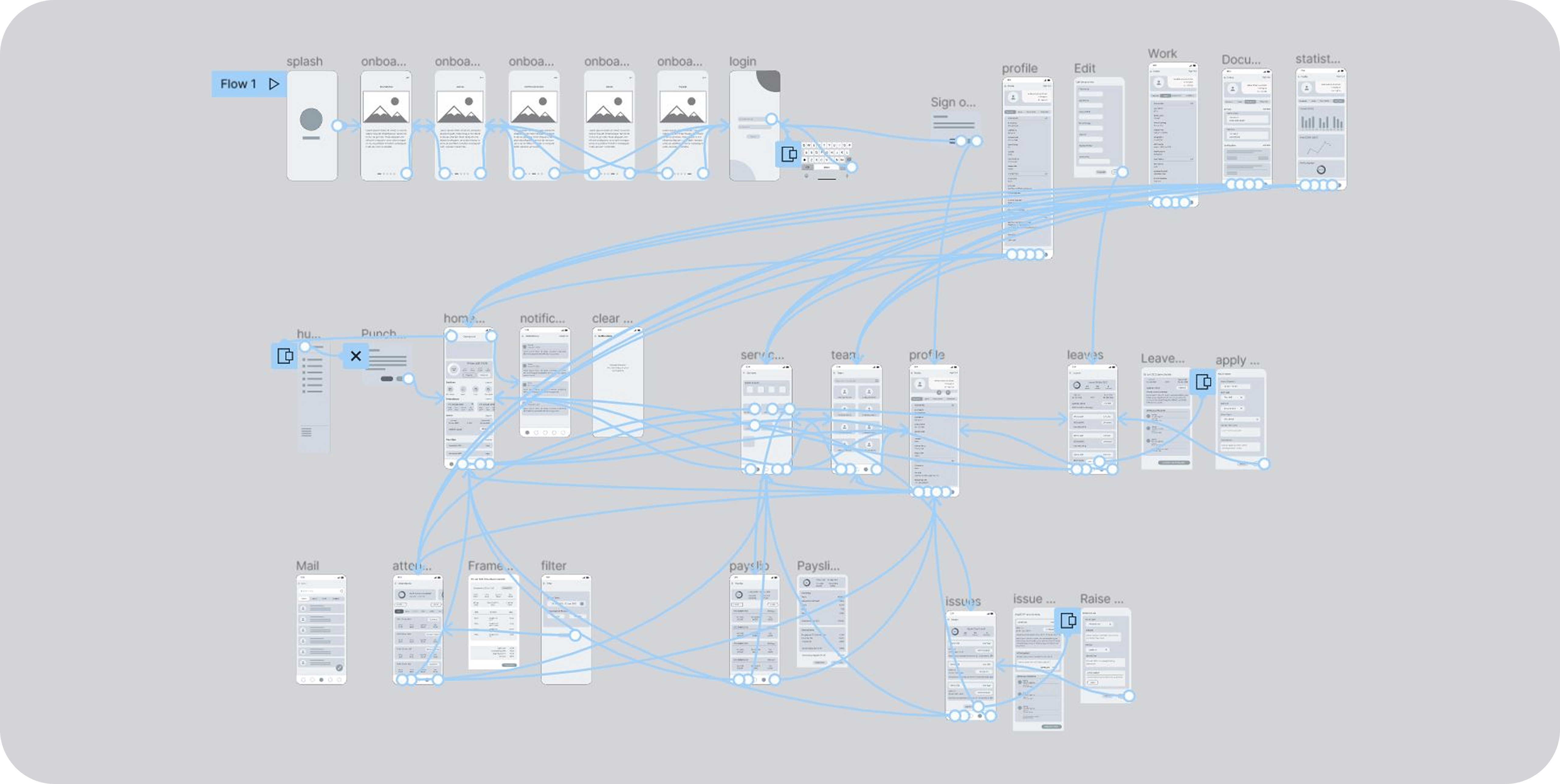
Before adding any colour or typography, I built out low-fidelity wireframes for all five service modules and the core navigation structure. This phase was about validating layout, hierarchy, and flow — not aesthetics.
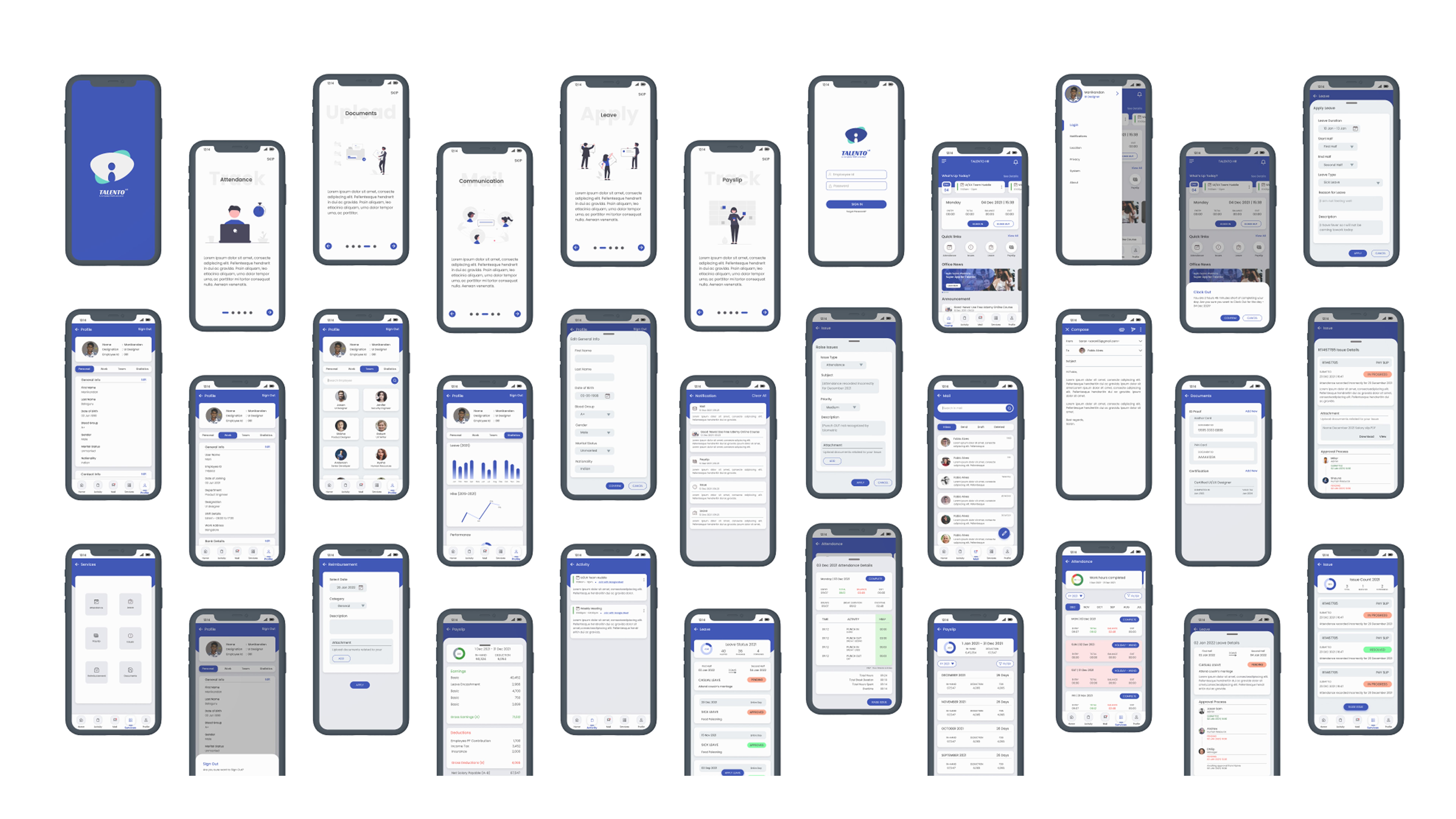
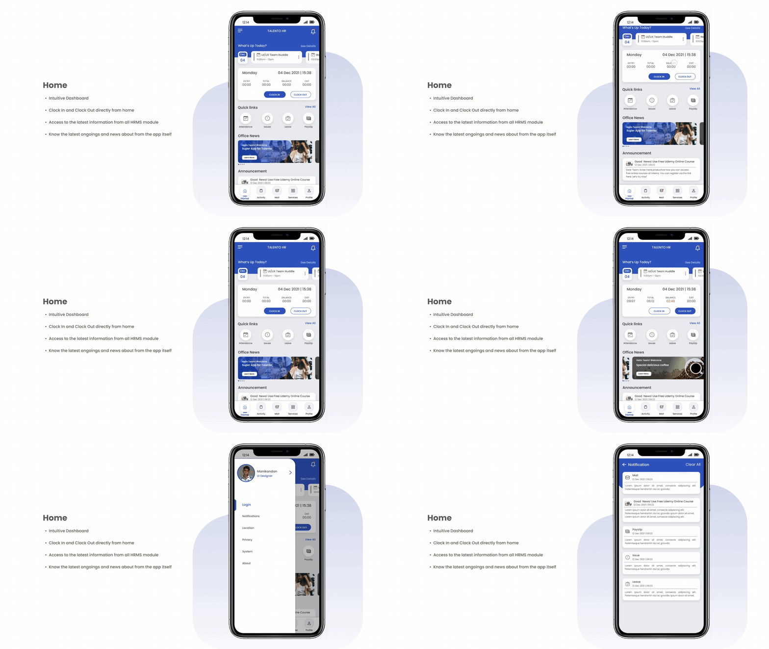
The complete hi-fidelity screens across all modules - each flow recorded as an interactive walkthrough.
Onboarding
Splash & sign up flow
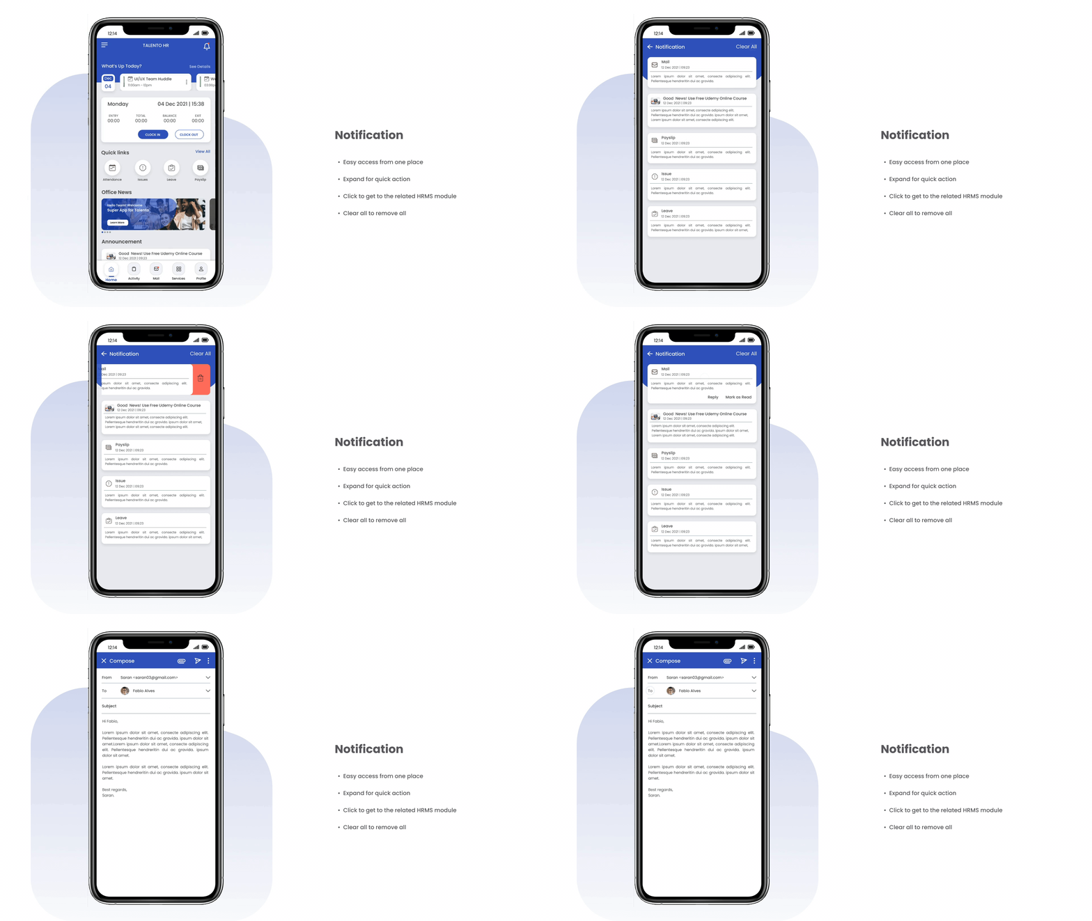
Home
Dashboard & quick actions
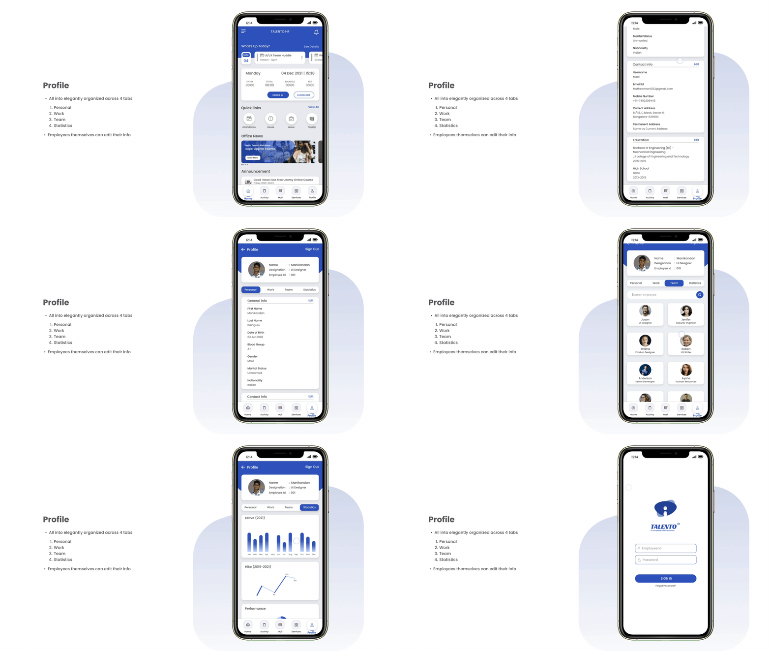
Attendance
Daily & monthly records
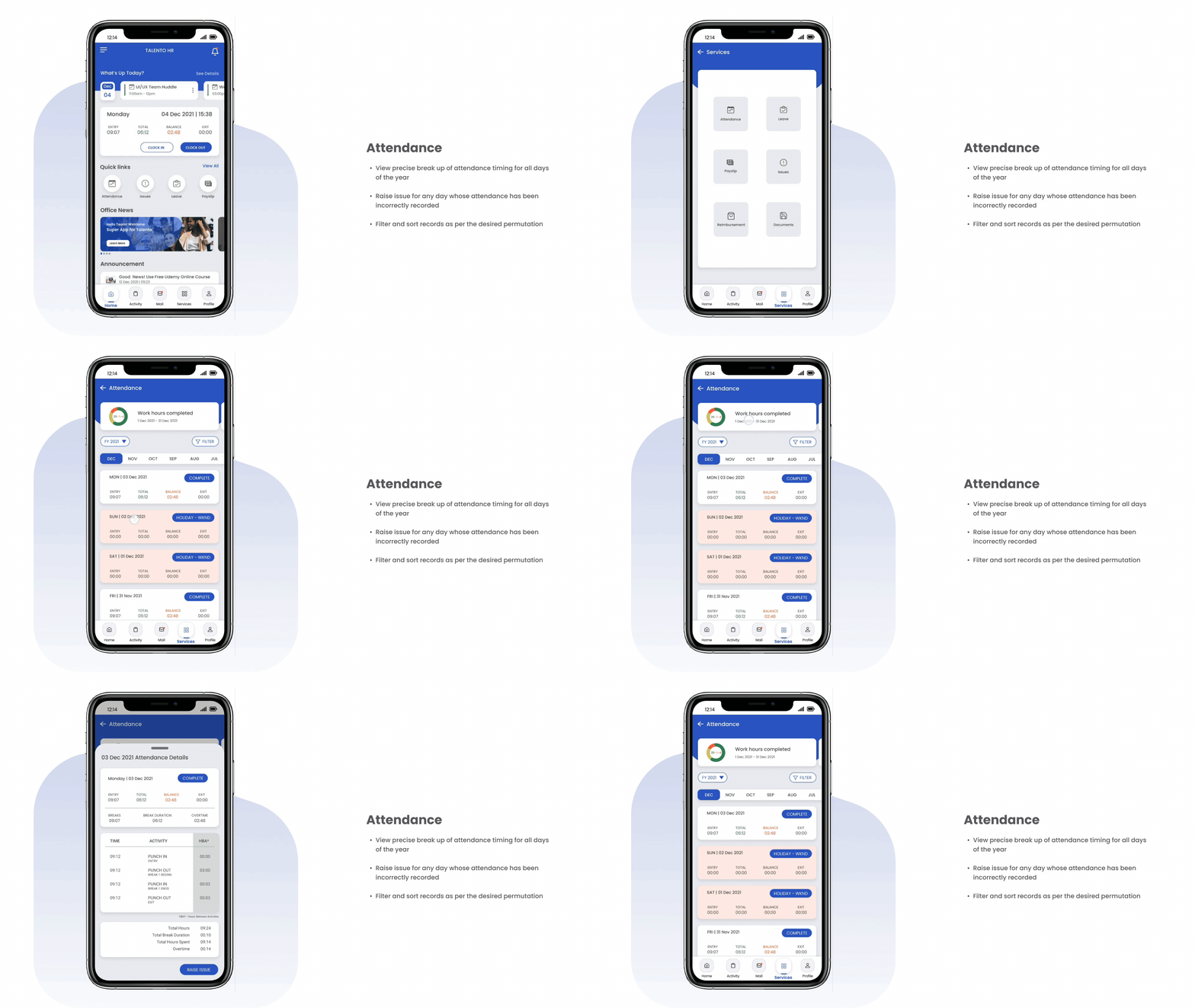
Leave
Apply & track leave status
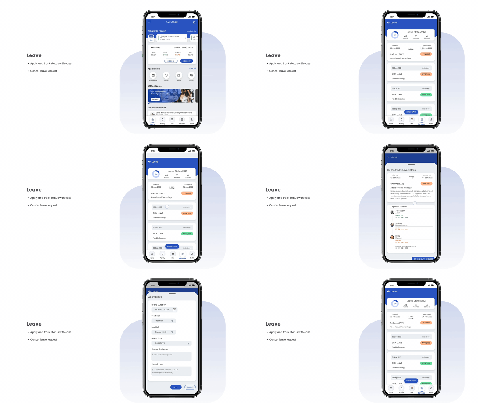
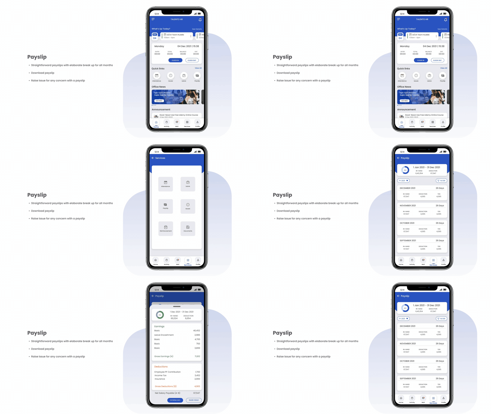
Payslip
View & download payslips
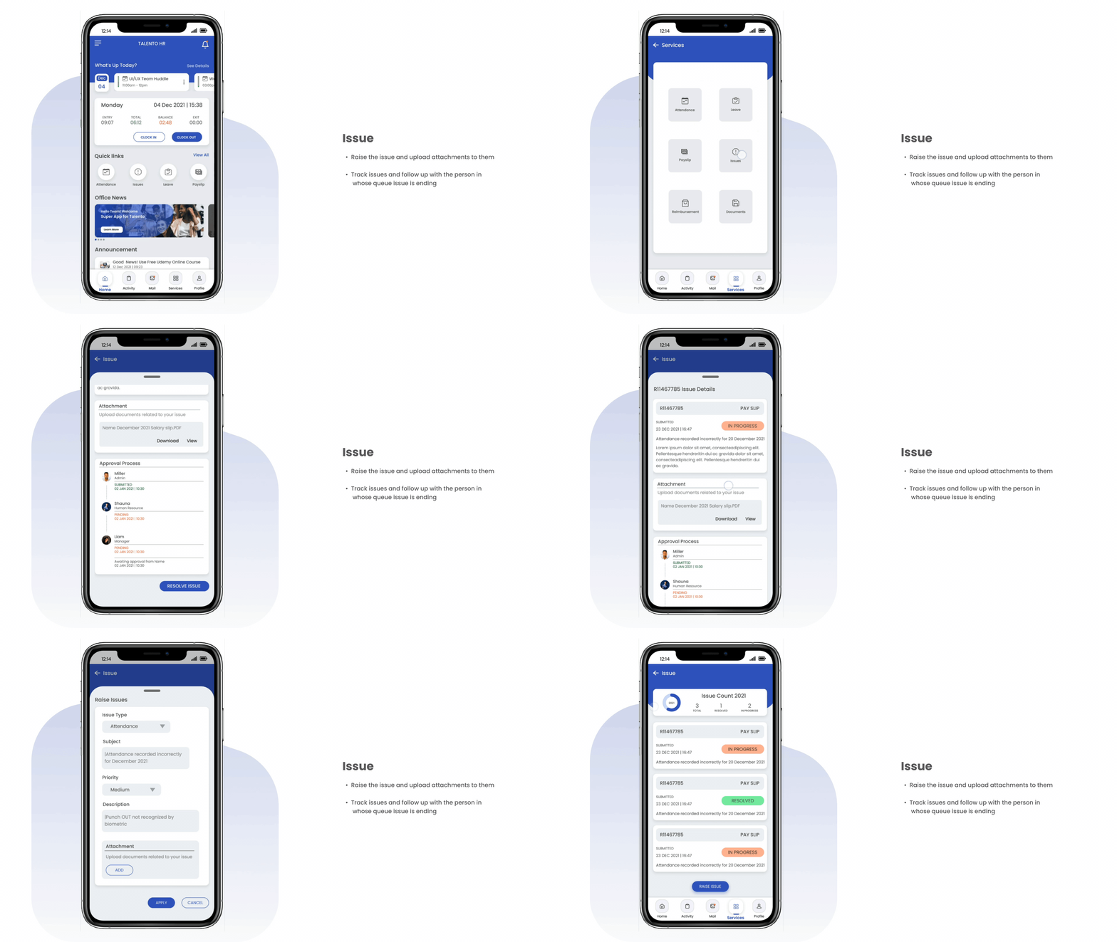
Issue
Raise & track issues
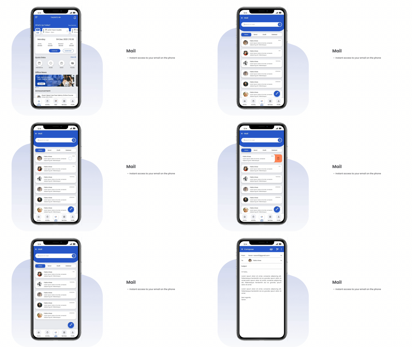
Profile
Personal & work details
Internal communication
Once the hi-fi prototype was ready, I ran two rounds of validation before handing off to development.
I ran a System Usability Scale (SUS) survey with users after they tested the prototype. SUS is a standard 10-question survey, scored 0-4 per question and converted to a 0-100 scale. A score above 80 is considered excellent - 87 told me the design wasn't just usable, it was genuinely easy to navigate.
I ran task-based testing on core actions like applying for leave and checking a payslip - once using the old scattered workflow, once on the new prototype. Comparing average completion times before and after showed roughly a 40% drop.